Case Study · Consumer · Beauty
Live site2025 - Consumer · Beauty
ADDICTION
Skin
A new obsession, engineered from zero.
We built ADDICTION Skin end-to-end - brand, formula, packaging, site, and story. From an insight about how women actually use skincare to a shelf-ready line that reads like a fashion label.
What we did
0 → 1
Full brand build in-house
8
SKUs launched in year one
4
Colorways across the range
01 - Identity · 01
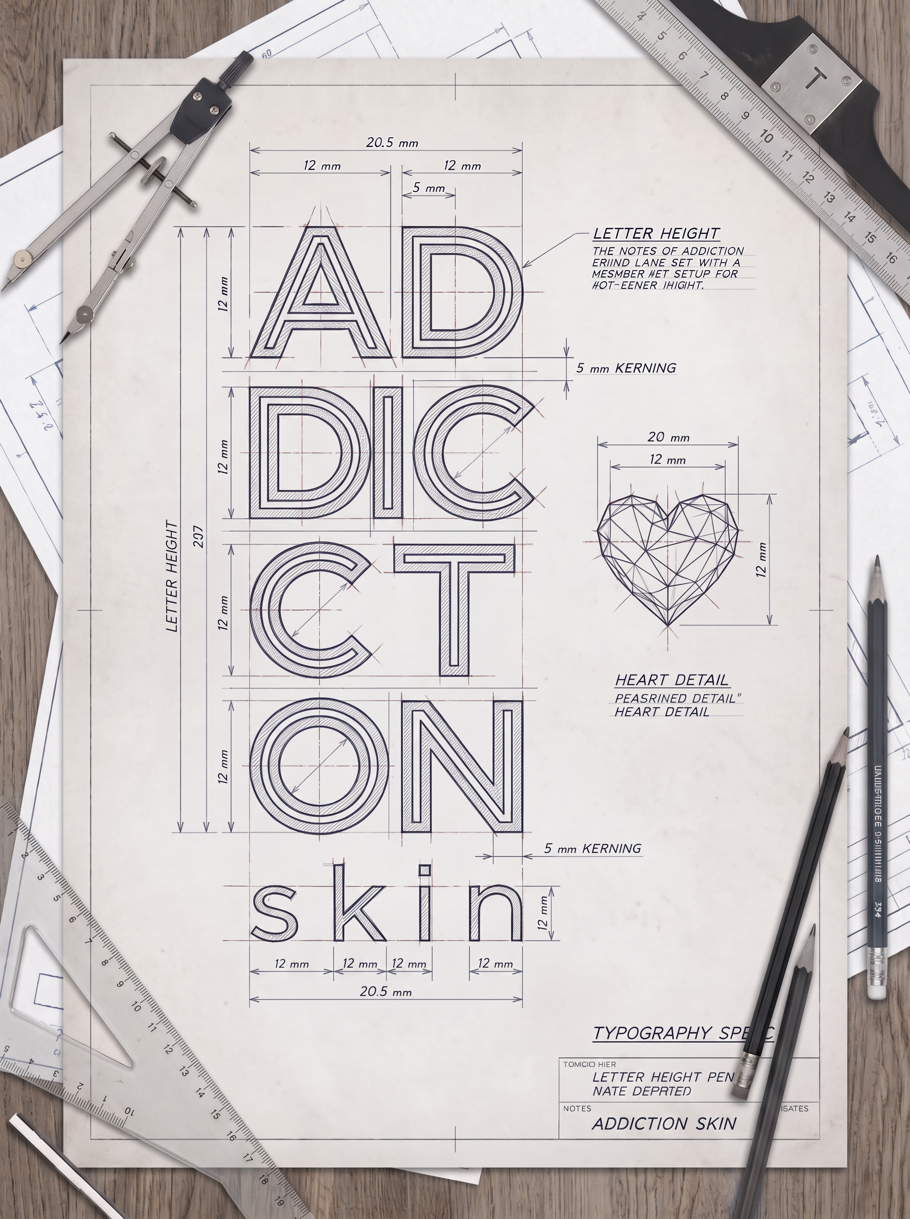
A wordmark that feels like a habit.
A confident serif wordmark, tuned for lipsticks and labels. Built to sit as comfortably on a bottle as it does on a billboard.
02 - Packaging · 02
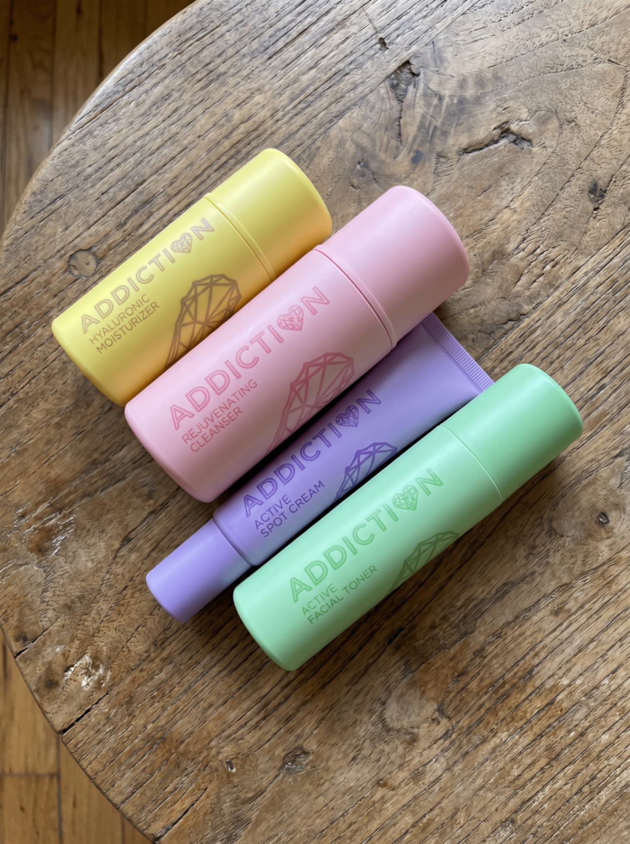
Color that earns a second look.
Custom tube architecture in yellow, mint, lavender and blue. Every SKU is instantly identifiable across the shelf, the sink, and the feed.
03 - Story · 03
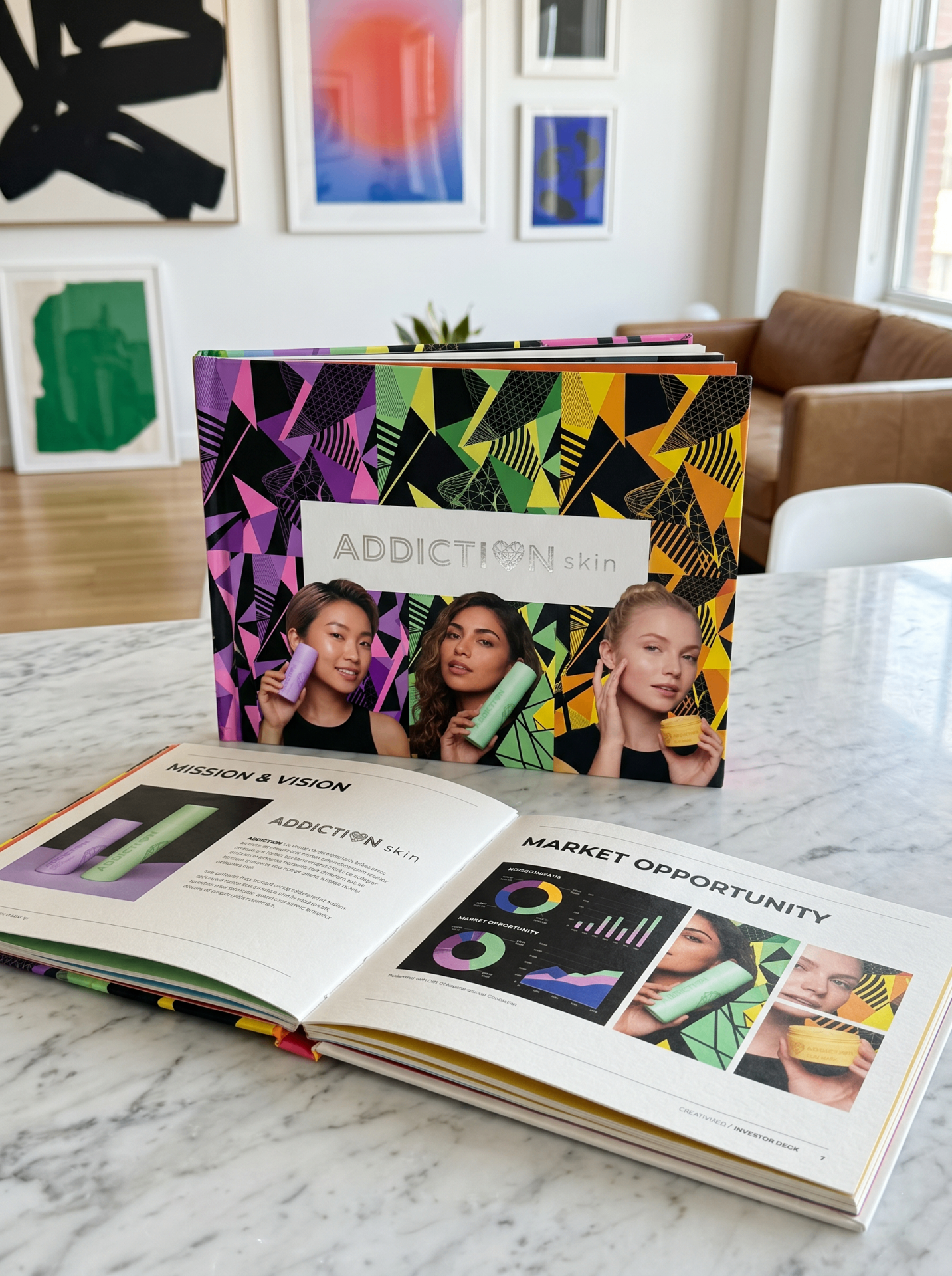
An investor deck that closed the round.
We wrote the narrative, designed the deck, and modeled the numbers. Positioning, market, product roadmap, and unit economics - one file, one voice.
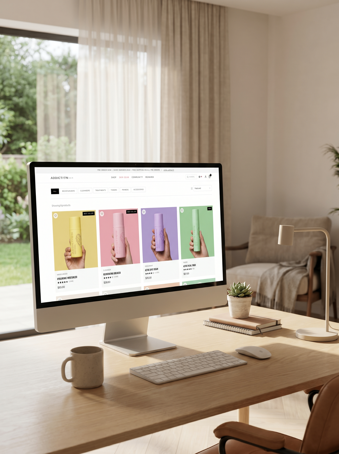
04 - Commerce · 04
A store that sells like the brand looks.
Custom Shopify build with editorial PDPs, subscription mechanics, and a checkout tuned to the actual buying rhythm of skincare.
05 - Campaign
Photography that lives past launch day.
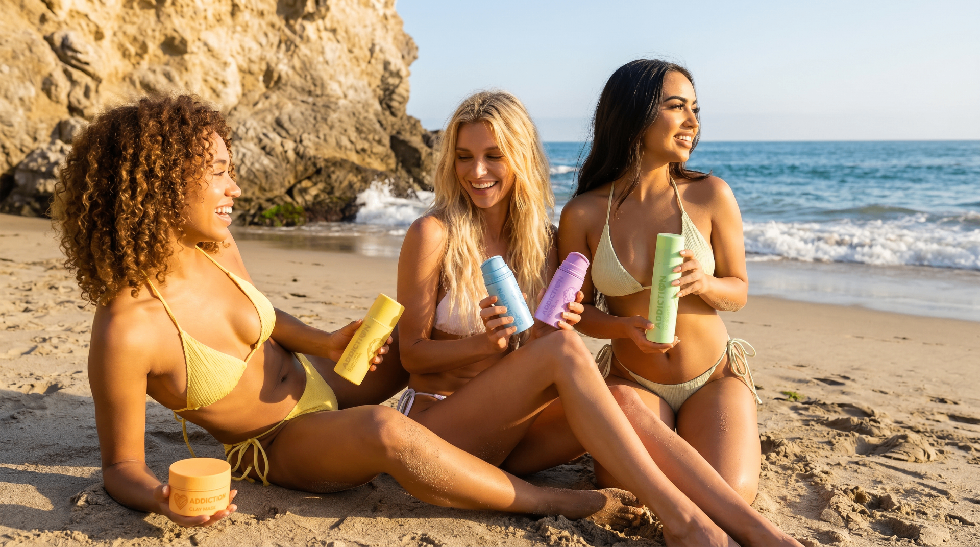
A single shoot day, engineered to feed the site, the ads, the deck, and 12 months of social. Malibu light, real friends, honest color.